A expansive rebrand for a healthcare-native education company; leading the work from a market & competitor analysis, through three exploratory brand systems for stake, to a final identity codified in a 64-page brand guidelines document that's ready for market.
role
Creative Director
client
Evidence In Motion
year
2025 - 2026
scope
Brand strategy, identity, system, guidelines
01 · THE BRIEF
EIM was the most clinically rigorous program partner in healthcare education and the market couldn't see it.
04
COMPETITORS AUDITED
Risepoint, Noodle, 2U, Keypath. Two visual modes between them — institutional navy and consumer-tech orange. Nobody read clinical.
18
STAKEHOLDER INTERVIEWS
University partners described EIM in clinical terms first, OPM terms second. The market already saw us differently than we saw ourselves.
03
FINAL BRAND SYSTEMS
Three full directions presented to leadership, each tested against the wedge with desktop, identity, voice, and tonal guidance.
02 · Phase TWO
Market & brand-state analysis.


The category will consolidate. Specialists with proof will win the next cycle. Our job was to make sure the market knew which kind of company EIM was — before our competitors had a chance to reframe us.
— Strategic conclusion · Brand state analysis deck, slide 10
03 · Phase THREE
Three exploratory brand systems, each built around a different bet.
Rather than shepherd one safe direction through committee, I built three honestly different systems and let the work argue for itself. Each started from a single strategic bet about what would close the perception–reality gap — then was built out as a complete world: concept line, color theory, type pairing, motif, and a full responsive website mock. Same content, three convictions, tested side-by-side against the wedge before a single slide went to leadership.

THEME 01
EXPLORED
Cutting-Edge Education
Warmth meets precision. Soft serif headers, a single high-voltage red, angular cut-corner cards.


THEME 02
EXPLORED
Measured Impact
Bold, data-driven results. Oversized statistics carry the page; deep navy field; sleek and modern.


THEME 03
CHOSEN
Continuous
Growth
Progress with purpose. A line that always ends upward, rounded forms, warm blue plus a salmon spark.

04 · Phase FOUR
Why we landed on Continuous Growth.
I scored all three against the criteria the strategy work had surfaced — not on taste, but on which system could close the gap and still flex across every audience. Theme 03 was the only direction that held two things at once.

"Cutting-Edge was sharp. Measured Impact was loud. This one felt like us— and like where we're headed."
— Leadership Review, 2025
DECISION LOGIC
The winner didn't beat the others on beauty — it beat them on range.
Cutting-edge leaned into a serif heritage that pulled EIM back toward the prestige-navy mode we were trying to leave, and its red read closer to alarm than care. Measured impact was undeniable on proof, but a company whose product is people can't lead with cold numbers alone — so its best idea, the stat block, was folded into the winner.
Continuous growth was the only system that stayed credible and warm at the same time, and the only one whose motif — the upward line — gave us a reusable device across web, print, signage, and partner co-brand. It didn't just close the perception gap; it pointed at the future.
05 · Phase FIVE
The system, codified.
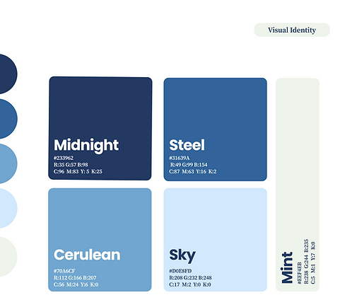
Selected pages from the final brand guidelines — logo construction, color system, typography, and tone of voice. The full document runs 64 pages and includes motion principles, photography direction, and 40+ application patterns.


06 · IN MARKET
How the system shows up.
Continuous growth shipped across the EIM site and into print, campaign, and signage. The homepage and collateral below are the live build — same upward-line motif, warm-blue field, and mint, carrying real content end to end.


