Print Design
Print is rarely one thing. I work across the full range of physical formats — large-format environmental graphics, folded and multi-page editorial, packaging, and direct. The constant isn't a look; it's a discipline: hierarchy, production fluency, and a system that holds from a stage banner down to a bottle label.
role
Deliverable
Creative Director Print & Environmental
years
scope
Print systems, production oversight, vendor management
2018-2026
Conference, retail, healthcare, and hospitality print

One system, many pieces — a prescription packaging program worked out across wrap, bag, label, and box
01 · What This Page Shows
Conversion-first, brand-held.
Most landing pages force a choice: convert hard and look off-brand, or stay on-brand and convert soft. I don't accept the trade. Four principles keep both true at once.
01
Own a space
Large-format and environmental graphics that hold a room, a storefront, or a bus.
02
Carry a story
Folded and multi-page editorial that sequences information a reader can follow.
03
Wrap a product
Packaging and merch where the brand lives on a real object with real constraints.
04
Drive an action
Direct and loyalty pieces built around a single, clear thing to do.
02 · Own a Space
Environmental & large-format.
Designing for physical space means competing for attention in a loud, crowded environment, then communicating value fast — to someone driving past, walking a mall, or standing on a trade-show floor after six hours on their feet. The work has to read at a glance and survive the press at scale: color shifts, substrate, bleed, and vendor lead times all decided up front.

Walgreens · Fleet Bus Wrap

Kohl's · Storefront Windows
03 · Carry a Story
Editorial & brochures.
Folded and multi-page pieces are about sequence: what a reader sees first, what answers the next question, what closes. I design programs that stay coherent across a fold or forty pages — from a conference welcome book, to a dual-brand recruitment piece that honors a university's identity alongside a partner's, to a full employee handbook.

Align Conference · Welcome Program
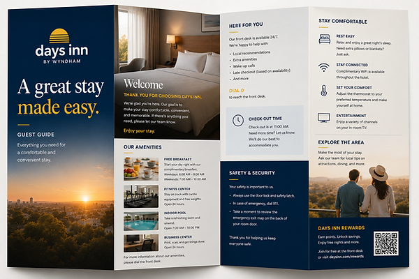
Days Inn · Guest Guide

Days Inn · Marketing Brochure

Walgreens · Employee Handbook
04 · Wrap a Product
Packaging & merch.
Putting a brand on a physical object is where design meets manufacturing. It has to be elevated enough for a national audience and practical enough to live on a water bottle — die lines, materials, and print method all part of the design, not an afterthought. A single system stretched from a prescription box down to a shirt tag.

Verve • Resistance Bands
05 · Drive an Action
Direct & loyalty.
Some pieces exist to do one thing. A loyalty card, a mailer, a rewards insert; single-purpose, built around a clear offer and an obvious next step, with nothing on the piece competing for the decision.

Kohls - Rebrand Rewards

Solace - Daily Greens Packaging