Designing
EIM Partnerships
How do you make a health-care company look like a serious academic partner — without losing the optimism that made the brand work? I designed a B2B website system for Evidence In Motion that turns vivid brand color, oversized data, and a single repeatable kit of components into credibility a provost can trust.
role
Graphic Designer
client
Evidence In Motion
year
2022-2023
scope
Brand evolution, component kit, full wireframe set

Home page · the redesigned EIM University Partnerships front door
01 · THE Design PROBLEM
Sell trust to people who don't buy on emotion.
A provost weighing a multi-year academic partnership is not moved by a hero photo and a friendly headline. They need to feel institutional rigor at a glance — and they need it from a brand whose existing site was built to sell continuing-education courses to individual clinicians. The design challenge wasn't a new logo. It was making the same brand carry a completely different kind of confidence.
02 · BRAND DECISION
Elevate the palette — don't replace it.
Throwing out EIM's vivid blue would have thrown out its recognition and its optimism. Instead I gave each color a job, then enforced the hierarchy ruthlessly so the same bright palette could read as institutional rather than consumer.

Blue - structure
Carries every decisive surface — hero, footer, CTA. Used at full saturation and full bleed so the brand feels certain, never tentative.
Teal - energy
Reserved for proof — the statistics bands and italic accent words. Forward motion, paired only with blue so it never feels decorative.
yellow + orange - warmth
Never type, only geometry — the rings and quarter-circles behind photography. The human counterweight to all that blue rigor.
Paper + Ink - rest
Long-form content lives on calm neutrals so the color hits harder when it arrives. Restraint is what makes the brand legible.


One page, five deliberate moves.

1
Italic-serif accent words
“Reimagining” breaks into a serif italic against a hard sans. One word does all the emotional work; the rest stays authoritative.
2
The photo lockup
Real photography shot on-site at partner labs and events, framed in a circular crop inside an offset gold ring and a teal quarter-shape — a lockup that makes every image unmistakably EIM.
3
Data as the headline
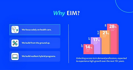
Labor-market growth becomes a hand-built bar chart. The pitch isn't “we're nice” — it's “these professions are growing 14–28%.”
4
Proof, not adjectives
A provost-level testimonial carousel sits high on the page. Peers persuade institutions faster than copy ever will.
5
Partners, shown as equals
A single flat logo strip — Hanover, Hawai‘i Pacific, Augustana, BGSU — gives every institution identical weight. No “featured” tier, no ranking; belonging is the pitch.
6
Featured news keeps proof live
A rotating card — “HPU Achieves Candidacy” — keeps a fresh, dated win on the home page, so the argument never looks static and every visit shows momentum.
7
The page is a funnel
Every page ends in the same “Let's Chat” form. There is exactly one conversion goal, repeated everywhere.
04 · Persuasion Design
Let the numbers do the convincing.
For a skeptical institutional buyer, a big confident number is the most persuasive element on a page. So I built the system around oversized statistics — set in brand blue, dropped into full-bleed teal bands, repeated on every page until the proof feels inevitable.
Growth charts as sales tools.
The home page turns dry labor-market projections into a rising bar chart — PT, OT, SLP and PA stacked from 14% to 28% growth. It reframes the entire pitch: partnering with EIM isn't a cost, it's access to professions that are about to boom.
05 · System Thinking
A kit of parts — not a pile of pages.
Behind every page is the same short stack of components. A new page isn't a new design — it's a re-order of blocks the system already owns. That's what let the site scale to a full sitemap, stay perfectly consistent, and remain editable by a non-designer.
The discipline is the deliverable: fewer parts, used more confidently, is what reads as “sophisticated.”

About Us

Disciplines

Services

Deep Dive Into Each Service
06 · The Bigger Move
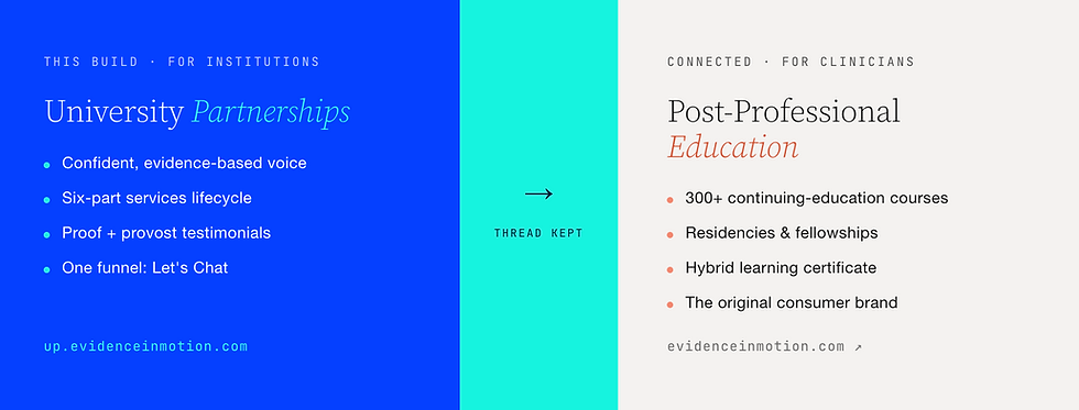
Two audiences, one ecosystem.
The hardest strategic call wasn't visual. A separate B2B site risked orphaning the consumer brand that built EIM's reputation. So the design keeps a live thread between them — the post-professional link rides in the primary nav of every page, framing the new site as the front of a single continuum rather than a spin-off.